Client: ASI-GIZ Challenge Fund
Year: 2025
Role: Brand design and communications
A Bright identity for big climate ideas
The Challenge Fund needed an identity that could make climate-resilient infrastructure feel urgent, credible and full of possibility.
A bold visual system was created to turn a complex funding opportunity into a clear invitation for innovators to get involved.


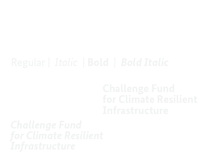
Type that gets to the point
BundesSans Office gives the system a clear, confident voice. Bold weights make headlines and calls to action impossible to miss, while regular styles keep detailed funding information accessible and easy to navigate.
A mark with momentum
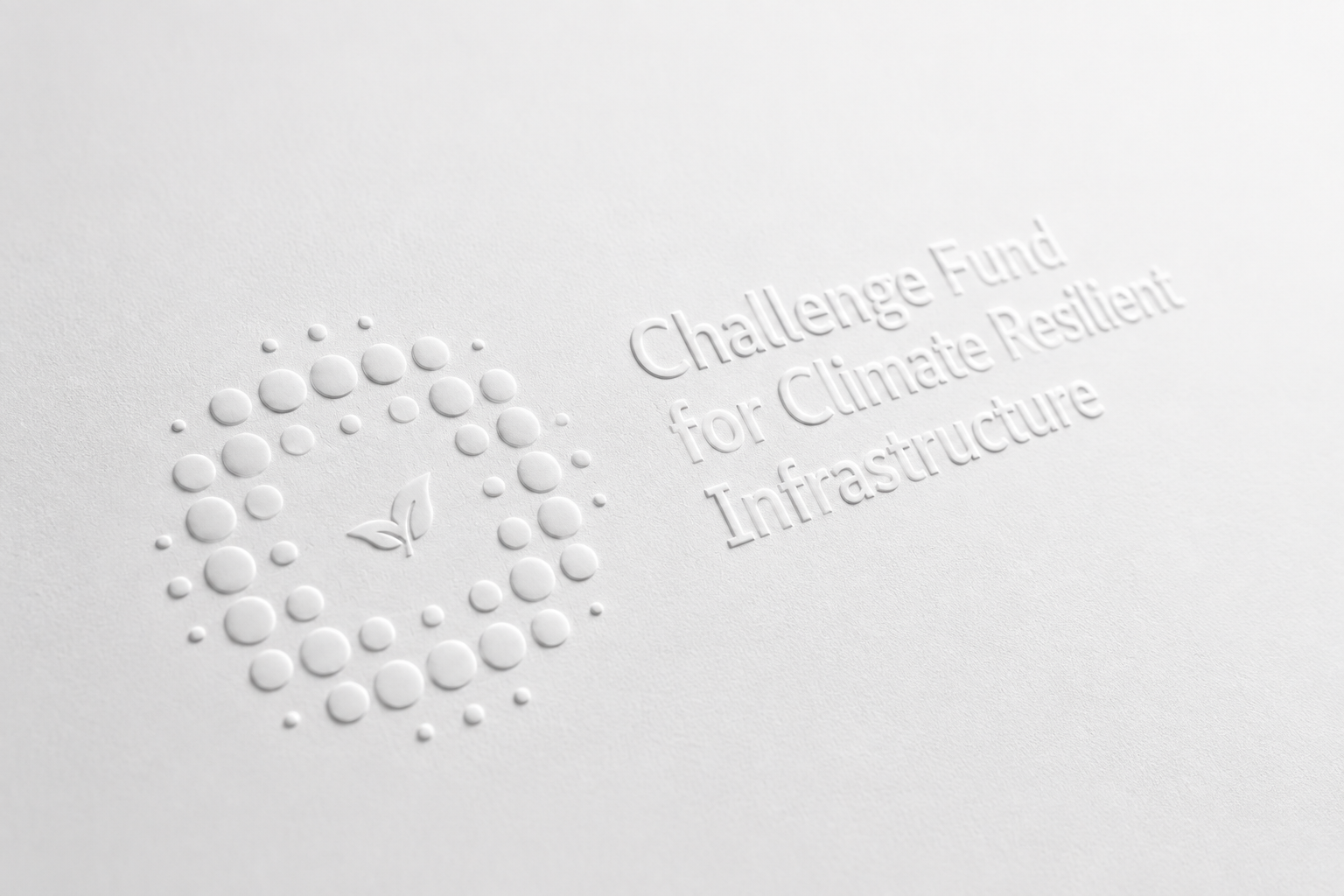
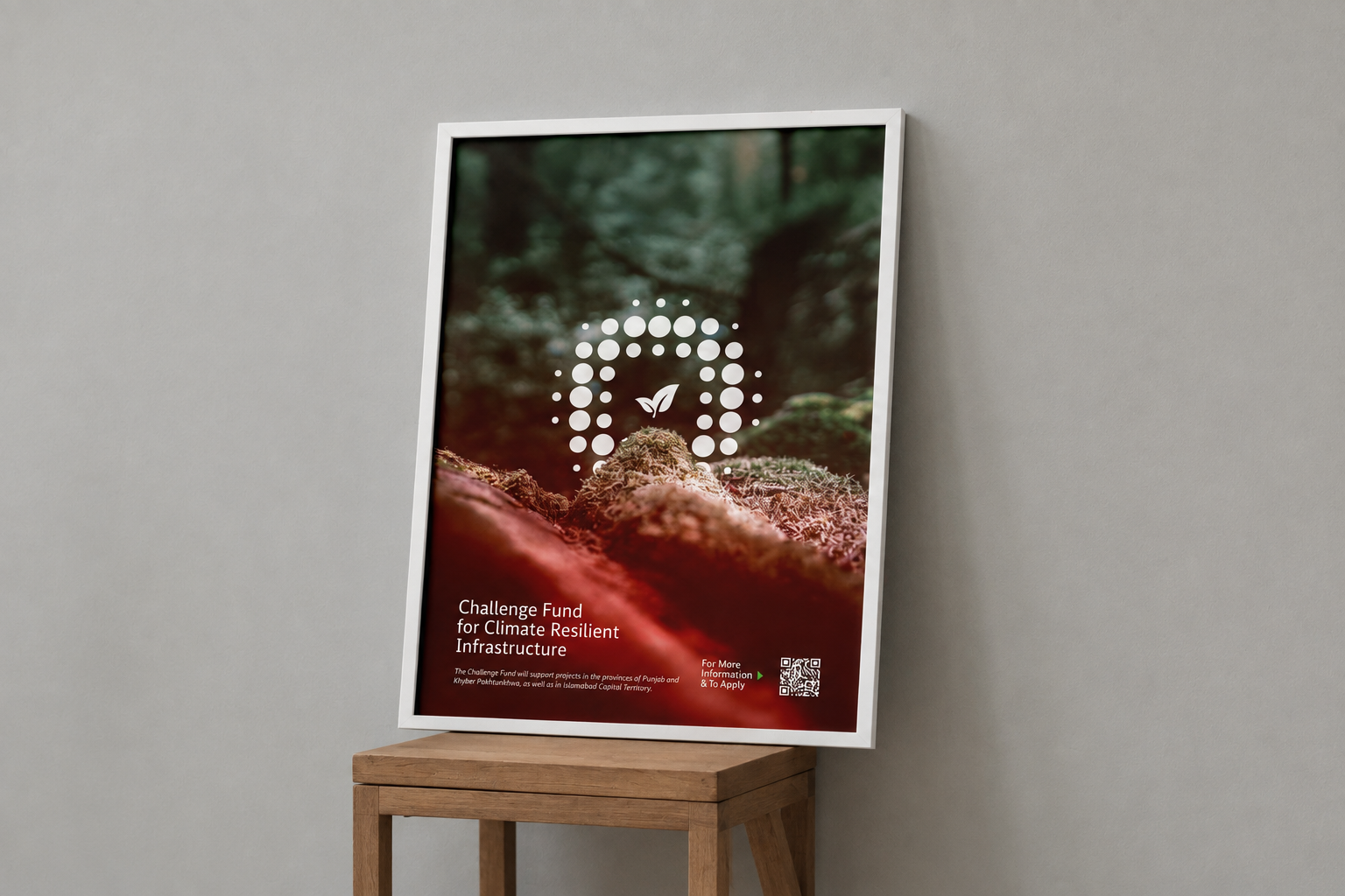
Built from a central leaf and an expanding field of dots, the symbol captures an idea growing through collaboration. Deep green grounds the identity in climate and resilience, while vivid coral brings warmth, energy and urgency. Together, the colours move beyond the expected institutional palette, helping the fund feel serious enough for government and bold enough to be noticed.

From front page to feed
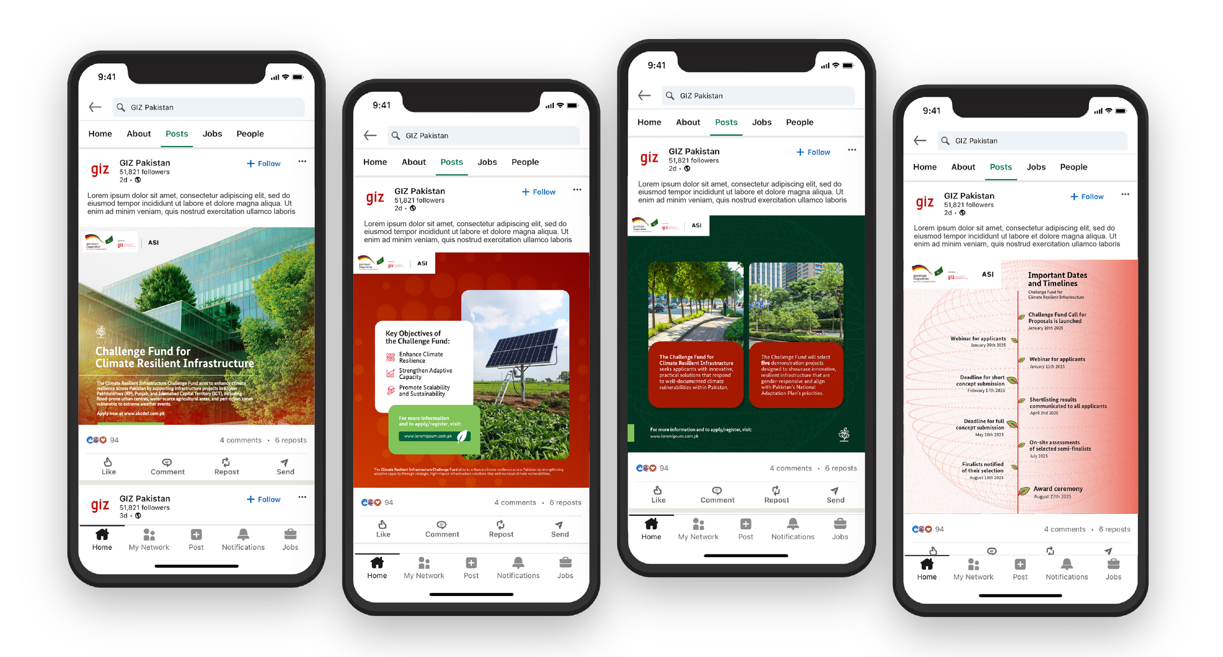

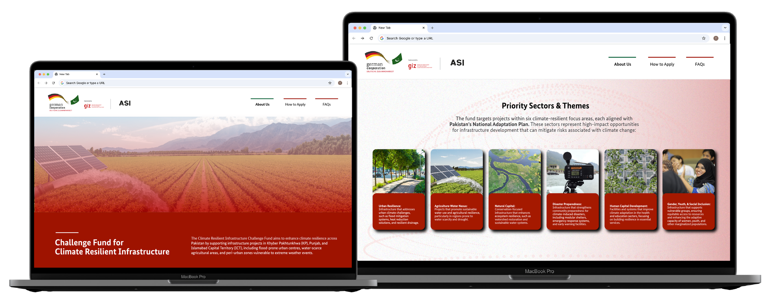
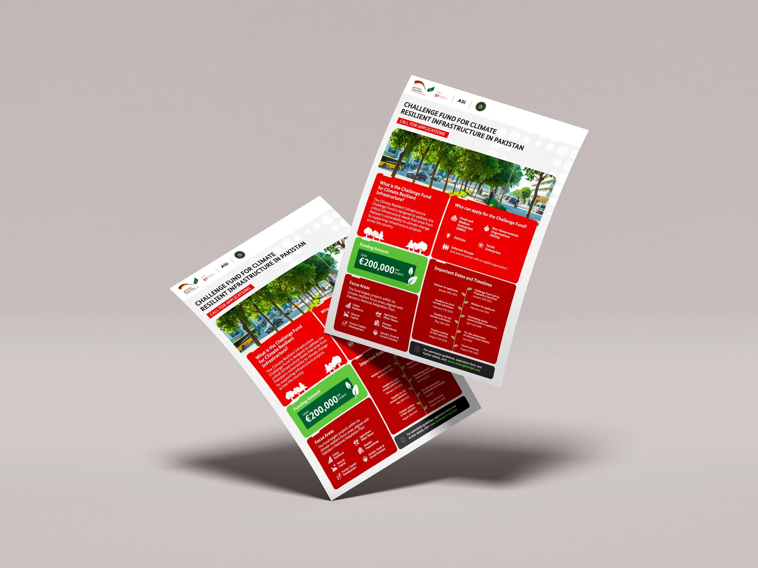
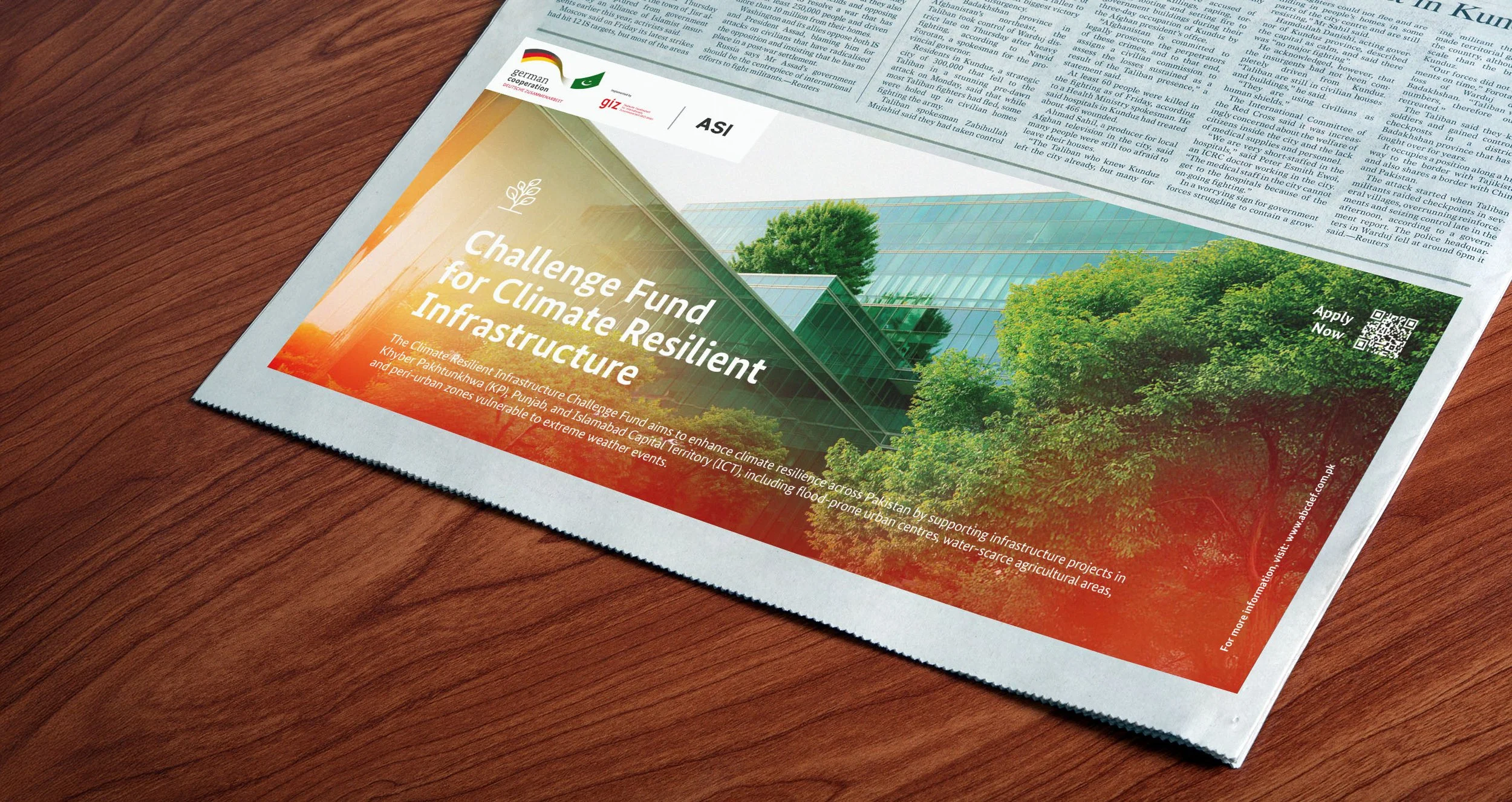
The identity was designed to travel, from newspaper advertisements and printed calls for applications to the website, webinars and social media.
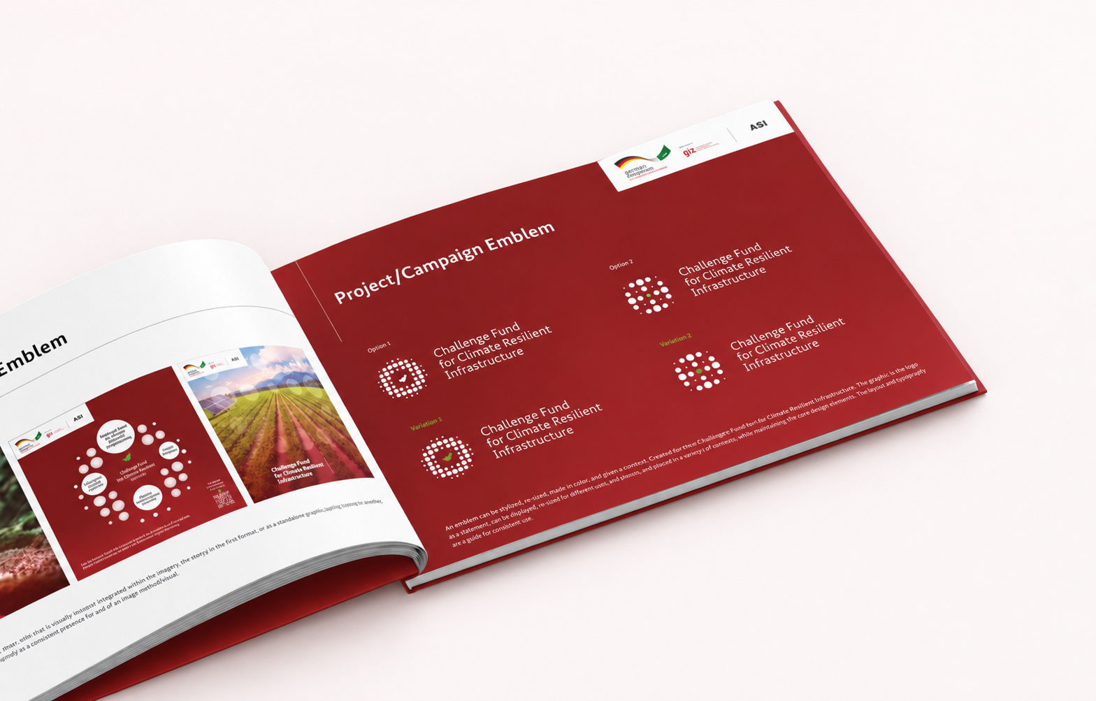
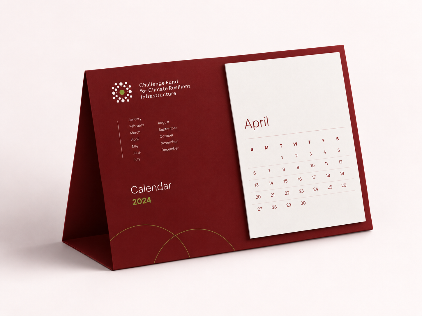
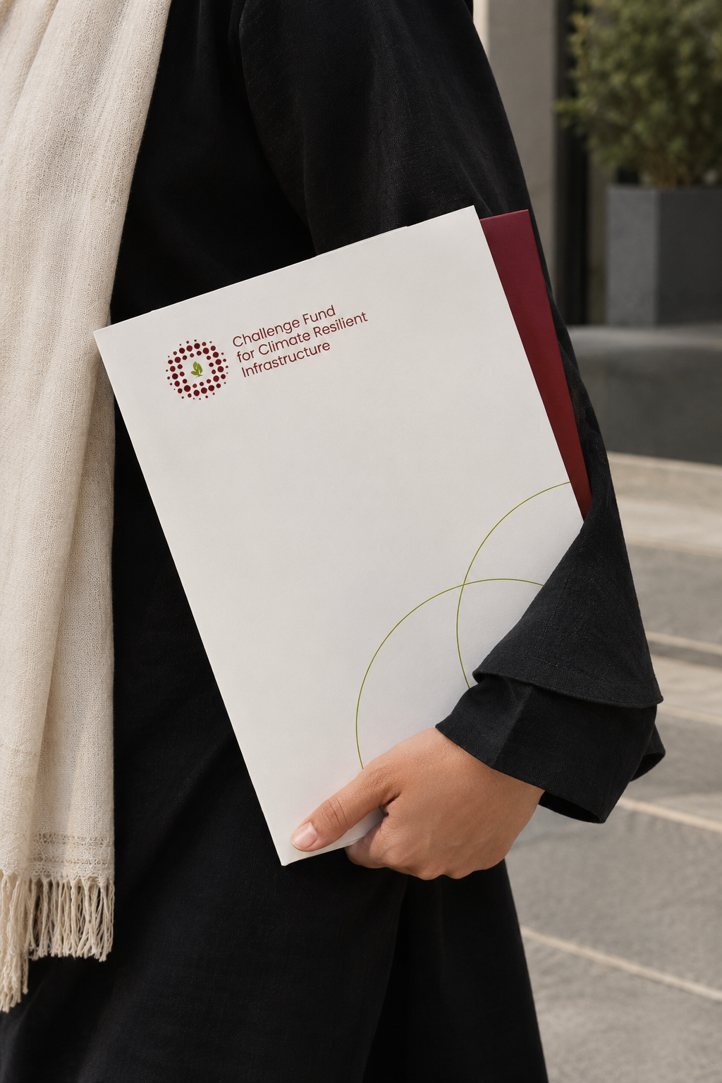
Brand guidelines, stationery, folders, campaign materials and digital templates turned the identity into a practical communications toolkit.
Every element was designed to help information land quickly, guide applicants clearly and keep the fund visually connected across channels.
One identity, plenty of places to go

Designed to spark action
The finished system gave the Challenge Fund a clear and engaging public presence, one designed to catch attention, explain an opportunity and help promising climate ideas take their next step.