Care, made visible
A new identity for 1stMED, bringing clarity, warmth and consistency to a healthcare recruitment brand, from its core mark to the everyday touchpoints used by carers, clients and care providers.
Built around care
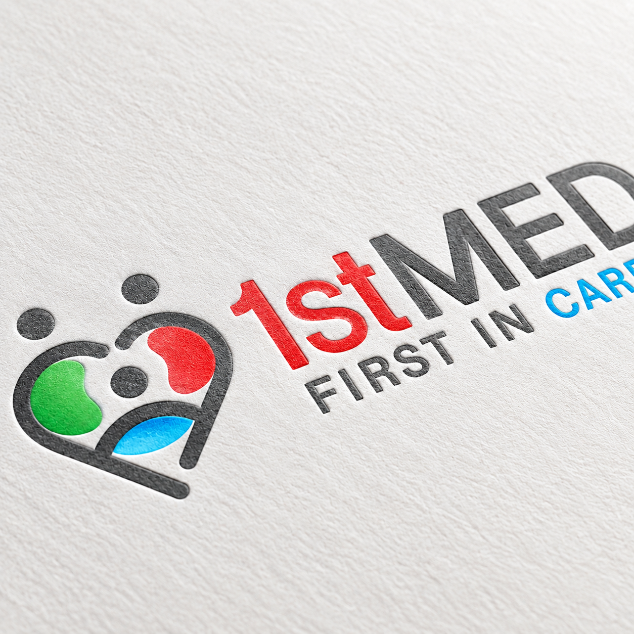
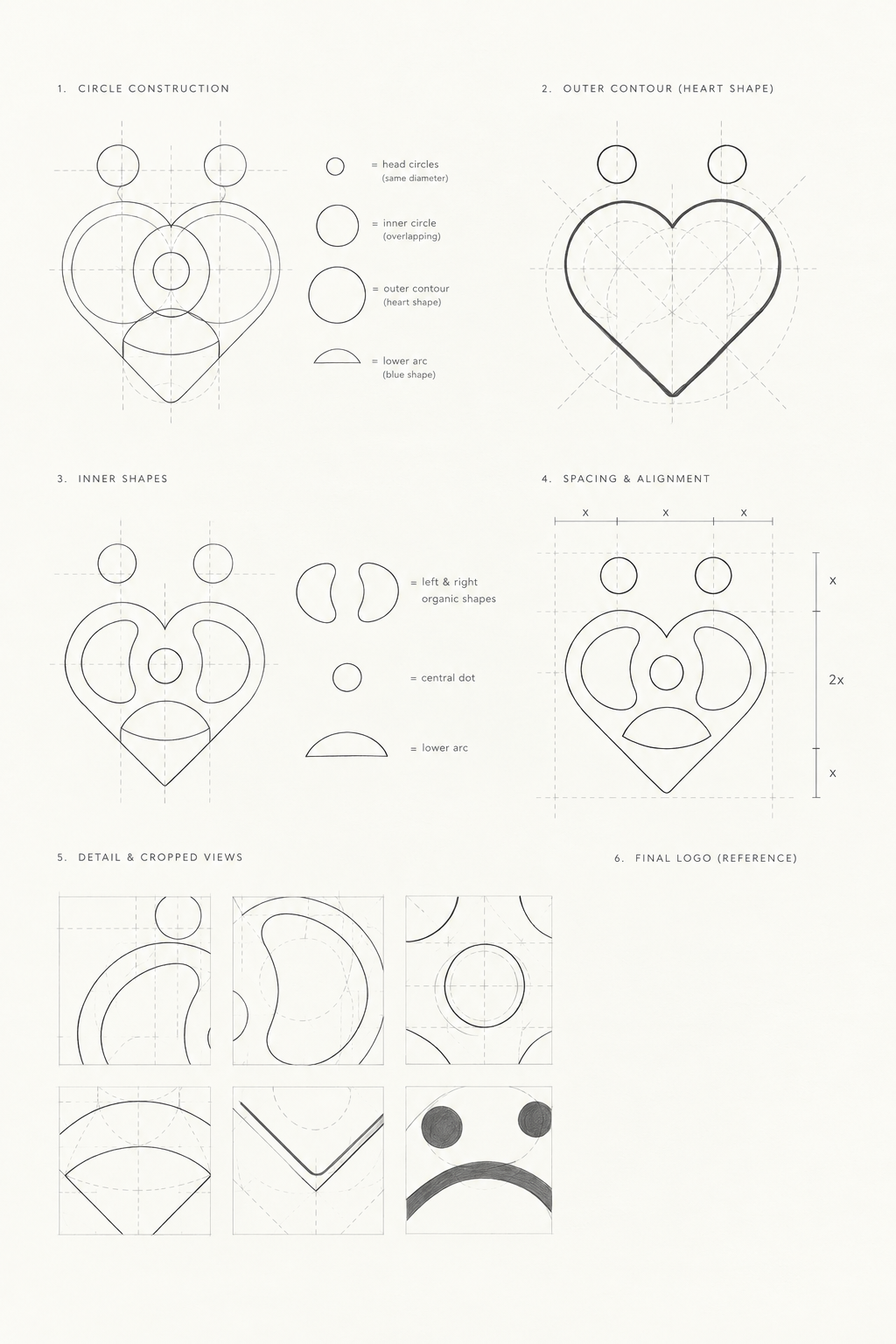
People, connection and care come together in a single heart-shaped mark. A simple geometry designed to remain recognisable across scales, formats and environments.
Identity system
One mark. Many moments of care
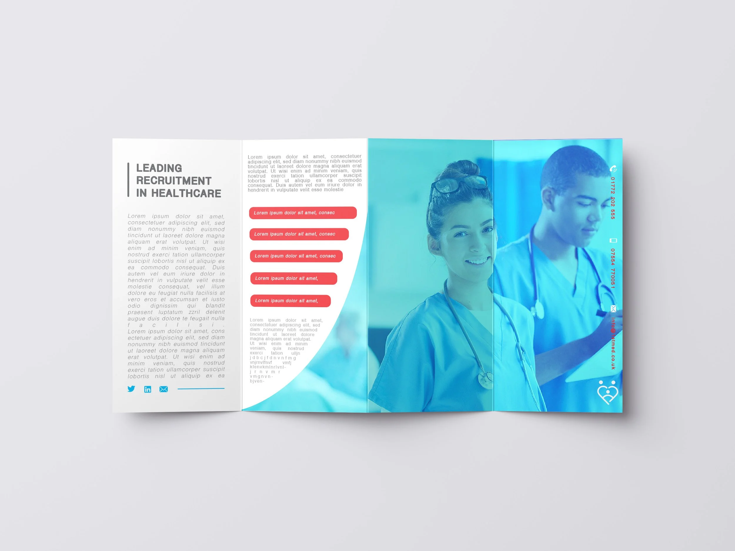
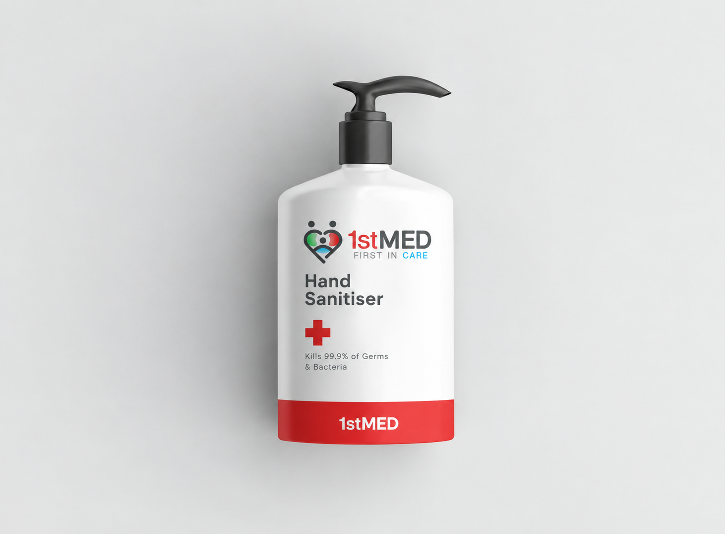
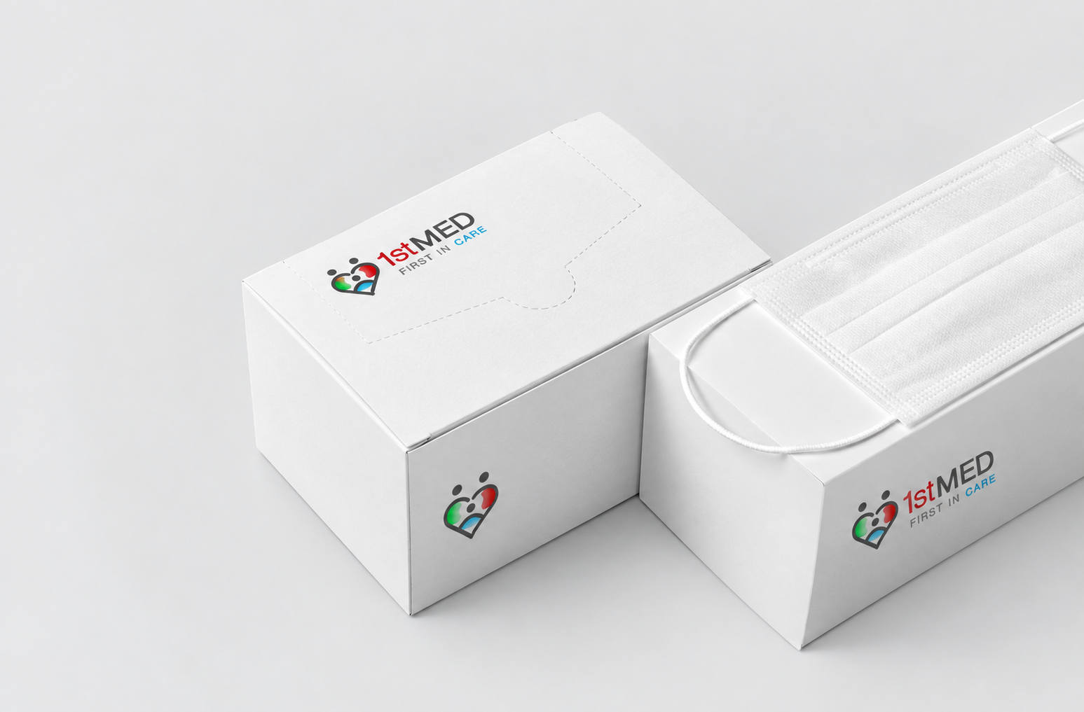
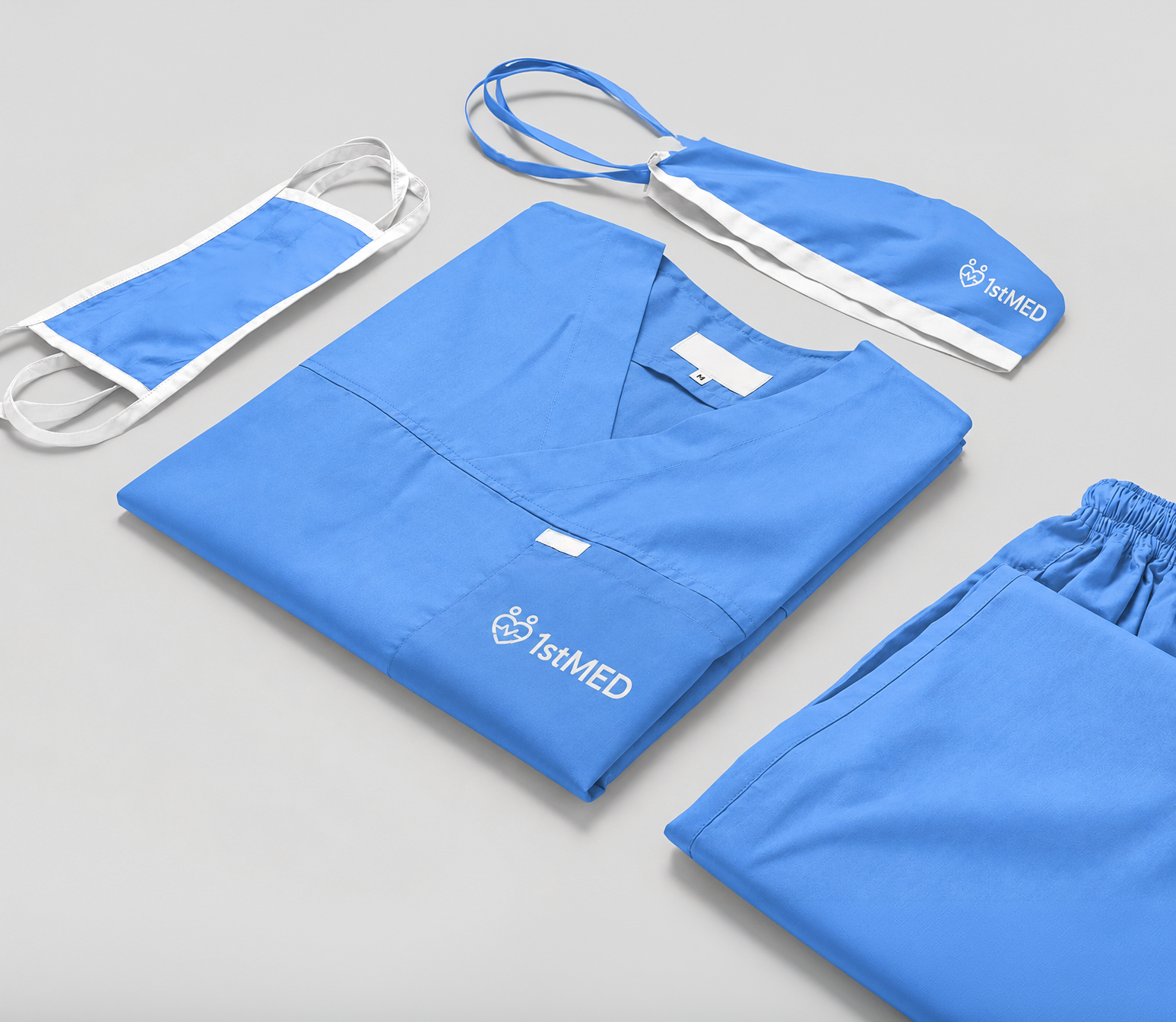
The identity was developed as a flexible system rather than a standalone logo, creating a consistent visual language across print, digital, uniforms, packaging and workplace touchpoints.
Brand applications
From first glance to first shift
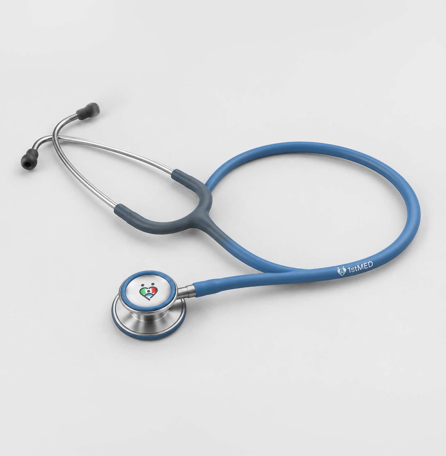
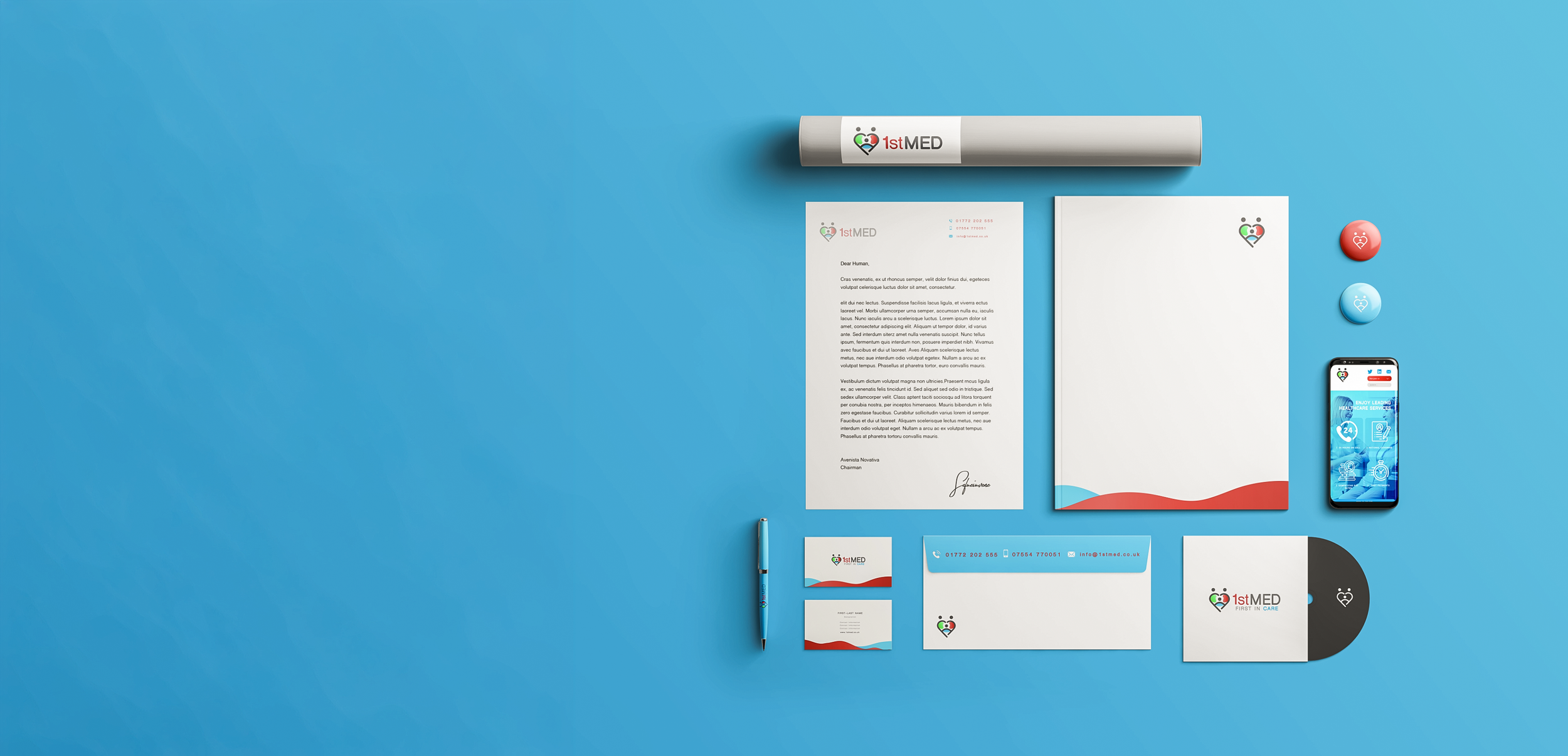
Colour, typography, imagery and graphic elements were carried across the brand experience, giving 1stMED a recognisable presence wherever people encounter it.
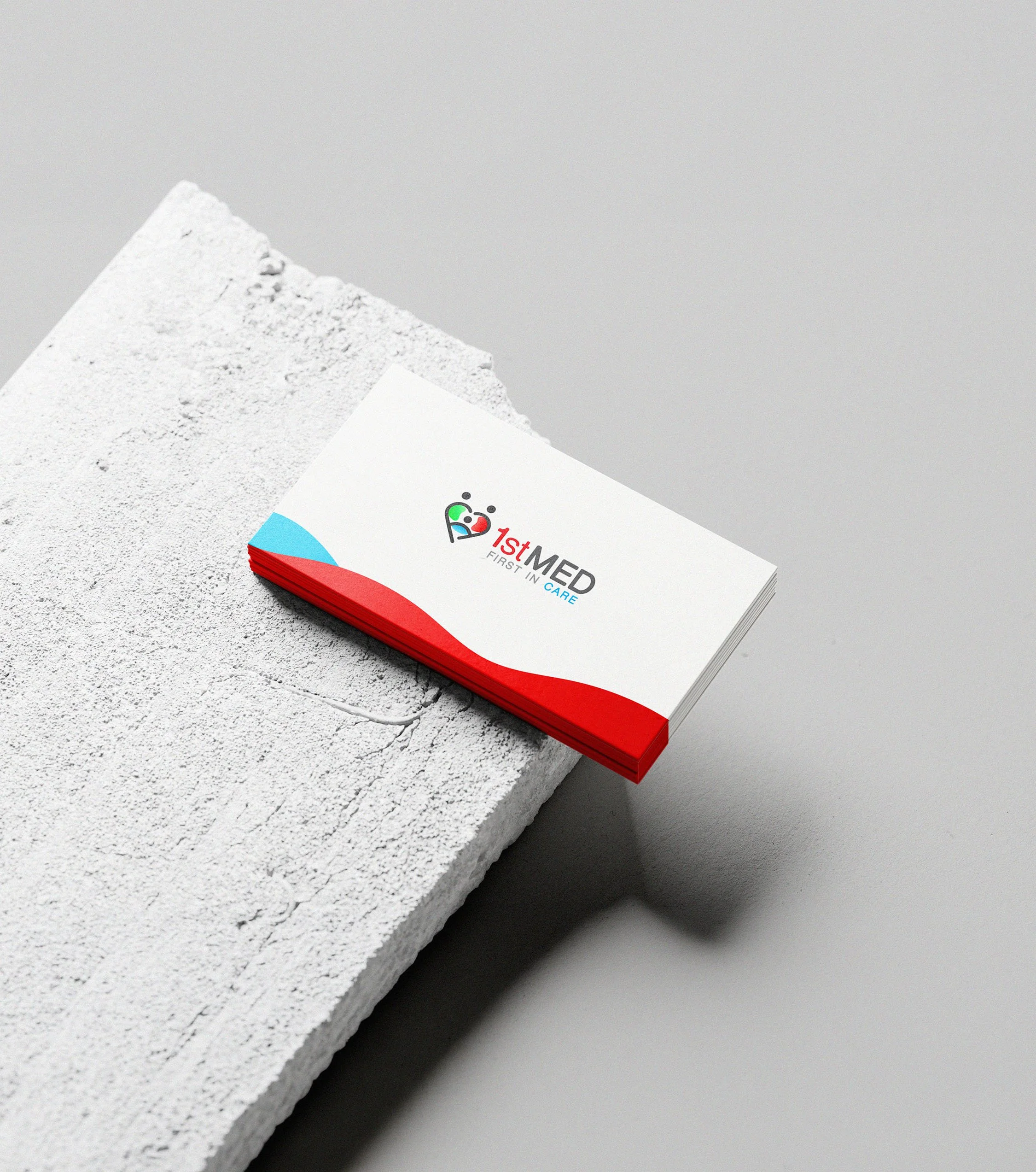
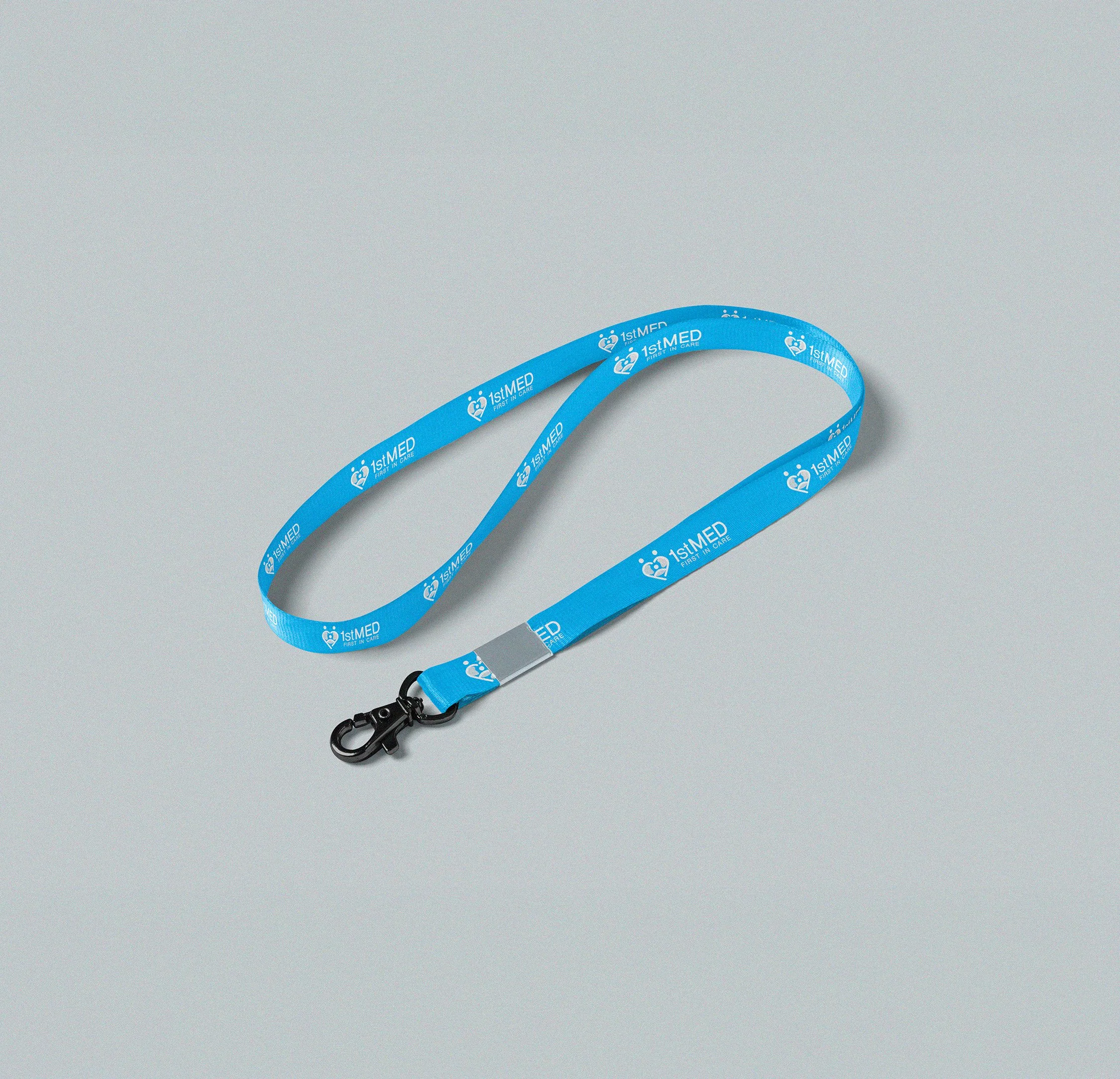
Consistency, by design
The identity extends across the everyday tools of the organisation, from correspondence and business cards to staff materials and digital communications. A consistent system designed to make every interaction feel recognisably 1stMED.
Website
Making care easier to navigate.
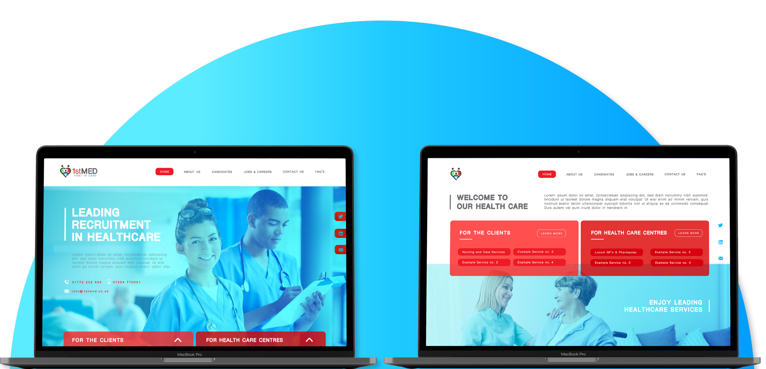
The identity moves into a user-facing digital experience designed around two distinct journeys: healthcare professionals looking for work and care providers looking for people.
Service design principles helped shape the information architecture around what each user needs to find, understand and do, reducing unnecessary steps and creating clearer routes through the service.
The brand becomes a service
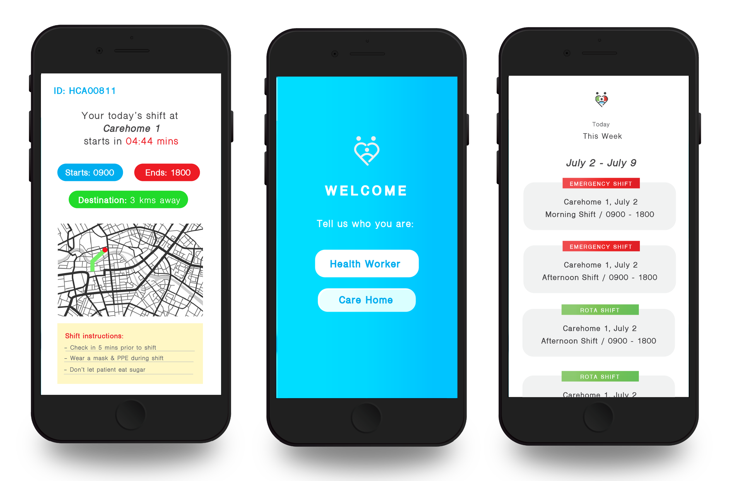
The mobile experience translates the identity into practical interactions around the working day, from onboarding and role selection to shifts, locations and instructions.
Rather than treating the interface as a visual extension alone, I mapped key user needs and moments across the journey, using hierarchy, status cues and simple navigation to make essential information immediately visible.